All Products

.svg)





Ask most BPO operations leads how their monthly numbers come together and you’ll get a slightly embarrassed laugh before the real answer. Someone pulls a CSV from the dialer, someone else exports queue stats, a third person cross-checks against the CRM, and it all lands in a spreadsheet that’s been patched together since 2022. It works, mostly. It’s also fragile, slow, and the kind of process that falls apart the moment the one person who understands the formulas goes on leave.
This piece is about getting out of that trap. It covers what clients actually want to see in an SLA report, how to build views for each account without duplicating work five times over, and when real-time visibility matters more than a document that lands once a month. None of it requires ripping out your existing stack overnight, or restructuring the company around a brand-new system. Most of it just requires centralizing data that’s already sitting in five different places.
Why BPO Numbers Turn Into a Mess
Here’s how it usually happens, and it rarely starts as a bad decision. A BPO signs its first few accounts and builds a report for each one, by hand, because that’s the fastest way to get something out the door. Fast forward two years, twenty accounts later, and there are twenty slightly different report templates, each with its own quirks, each maintained by whoever happened to build it originally.
Nobody planned this. It’s just what happens when this process grows organically instead of being designed on purpose. The dialer has one set of numbers, the queueing system has another, and the CRM has a third version that doesn’t quite match either. Reconciling all three by hand, every week or every month, is where a huge amount of ops time quietly disappears.
The uncomfortable part is that this isn’t just an internal headache. When a report is late, or two numbers in it don’t line up, clients notice immediately, and it colors how much they trust everything else you tell them. A single mismatched figure in an SLA summary can undo months of otherwise solid service.
There’s a real cost to this beyond the obvious embarrassment of a late report, too. Ops staff burn hours every cycle reconciling numbers that should already agree, hours that could go toward actually improving the floor instead of triple-checking a spreadsheet. I’ve seen operations where a single senior analyst spends nearly a full day each month just stitching together figures for a handful of accounts, work that adds zero value beyond making sure last month’s chaos doesn’t repeat itself this month.
What Clients Actually Want to See in an SLA Report
Strip away the formatting preferences and most accounts are asking for the same handful of things, presented clearly enough that someone on their side, who isn’t deep in your operations, can understand it in five minutes.
At a minimum, that usually means:
- SLA attainment, expressed simply: did you hit the target, and by how much
- Abandonment rate, since a caller who hangs up before reaching anyone is a service failure clients care about deeply
- Average handle time (AHT), both as a trend and against whatever benchmark was agreed at contract signing
- Outcomes by campaign, not just overall numbers, since a blended average can hide a struggling campaign sitting right next to a strong one
I’ve noticed that the accounts who ask the sharpest follow-up questions are usually the ones getting a clean, consistent report already. Confusing output invites confusion in return; clear numbers tend to get quieter, more strategic conversations instead of constant clarification emails.
Format matters more than people initially assume, too. Some accounts want a polished document that lands in an inbox on the first of the month. Others would rather log into a live view and pull whatever they need, whenever they need it, without waiting for anyone to send anything. Neither preference is wrong, and building flexibility into how output gets delivered, rather than forcing everyone onto one fixed template, tends to head off a surprising number of complaints that have nothing to do with the actual figures underneath.
There’s a customer angle underneath all of this too, even though clients are the direct audience for it. A BPO that can explain exactly why abandonment ticked up last week, because the underlying figures are already broken out cleanly, comes across as genuinely on top of service quality. One that can only shrug and promise to look into it comes across as reactive, even if the actual service delivered was fine. The report becomes evidence of competence in its own right, separate from whatever the numbers inside it actually say.
SLA Attainment: The Metric Everyone Asks About First
If there’s one figure that gets read before anything else, it’s SLA attainment. It’s the simplest possible summary of whether you did what you said you’d do, and it’s usually the number tied to contract penalties or bonuses, so nobody skips past it.
The trap here is presenting attainment as a single flat percentage without context. A campaign hitting 92 percent against an 80 percent target looks great. The same 92 percent against a 95 percent target is a problem, and burying that distinction in a footnote rather than the headline number tends to erode trust faster than the miss itself would.
There’s also a quieter problem worth naming: targets that were set once, early in a relationship, and never revisited even as volume or channel mix changed substantially. An 80 percent target that made sense for a small pilot campaign might be unrealistic, or too easy, once that same campaign scales to ten times the volume. Revisiting targets periodically, rather than treating them as fixed forever, keeps the attainment figure meaningful instead of becoming a number everyone quietly stops trusting.
A quick reference for the SLA metrics that come up most often:
| Metric | What It Covers | Why Clients Ask About It |
| SLA attainment | Percentage of interactions handled within the agreed threshold | Directly tied to contract terms and penalties |
| Abandonment rate | Share of callers who disconnect before reaching a team member | A visible sign of wait times running too long |
| Average handle time | Average length of a full interaction, including after-call work | Ties to cost per contact and staffing plans |
| Average speed of answer | How long callers wait before connecting | An early warning sign before SLA attainment drops |
| Outcomes by campaign | Conversion, resolution, or close rates split per campaign | Shows performance where it actually happens, not blended away |
Everything your team needs in one platform
Beyond SLA: Abandonment, Handle Time, and Outcomes by Campaign
SLA attainment gets the headline, but the metrics around it are what actually explain why the number moved. Abandonment rate, for instance, is often the earliest signal that something’s off, since it climbs before SLA attainment visibly drops. If wait times creep up, some share of callers give up before ever connecting, and that shows up in abandonment well before it shows up anywhere else.
Handle time tells a different story. A rising average isn’t automatically bad; it might mean the team is actually resolving things properly instead of rushing calls to hit a speed target. Context matters more than the raw figure, and a report that only shows the trend line without any note on what caused it leaves the account guessing.
Outcomes by campaign are, I’d argue, the most useful and least consistently delivered piece of all this. Blended, portfolio-wide numbers flatter everyone equally, hiding the campaign that’s actually struggling behind two that are doing fine. Splitting results out by campaign is more work up front, admittedly, but it’s the difference between an account that trusts the summary and one that keeps asking for the raw numbers because the summary never quite answers their question.
Picture a portfolio with three campaigns blended into one summary figure showing 78 percent attainment overall. Reasonable on its face. Split apart, though, two campaigns are actually running at 90 percent and the third is sitting at 55, dragging the average down and quietly costing that account real business. Nobody sees that story in the blended figure. Everybody sees it the moment results get split out by campaign, which is exactly why this cut of the numbers tends to get requested eventually, even by accounts who didn’t ask for it up front.
Worth adding: none of these figures exist in a vacuum from actual service quality. A campaign can hit every SLA target on paper while still leaving customers mildly unhappy, if the interactions themselves feel rushed or scripted. The numbers in this report answer whether commitments were met. They don’t fully answer whether the underlying experience was good, which is part of why pairing SLA figures with even a light quality review tends to give a fuller picture than either alone.
Real-Time Dashboards vs End-of-Month Reports
These serve genuinely different purposes, and treating them as interchangeable is where a lot of BPOs go wrong. A monthly document is for looking back: what happened, why, and what changed versus last period. A real-time dashboard is for right now: is today’s SLA attainment on track, and does anything need attention before the day is over.
A quick side-by-side of where each one fits:
| Aspect | Real-Time Dashboard | End-of-Month Report |
| Best for | Floor management, same-day decisions | Trend review, contract conversations |
| Update frequency | Continuous, throughout the shift | Weekly or monthly |
| Primary audience | Supervisors, floor management | Account stakeholders, executives |
| Shows | What’s happening right now | What happened, and why |
Where each one actually earns its place:
- Monthly or weekly summaries work best for trend analysis, contract reviews, and the kind of business conversation that happens on a call rather than a screen.
- Real-time dashboards work best for floor management: spotting a queue that’s backing up while there’s still time to shift staff around, rather than reading about it after the fact.
- Both together cover the full picture. An operation that only has one or the other is either reacting too late or drowning in daily noise without the context a period summary provides.
Clients increasingly expect at least some real-time access, even if they never actually log in daily. Just knowing the option exists tends to build confidence that nothing’s being hidden between report cycles.
A hybrid cadence tends to work well in practice: near-instant visibility for the figures that change hour to hour, alongside a slower, more narrative summary for the ones that only make sense viewed over weeks. Trying to force everything into one cadence usually means either drowning stakeholders in daily noise they never asked for, or leaving them blind to a problem that’s been building for three days before the next scheduled update finally surfaces it.
Why Real-Time Visibility Changes Floor Management
There’s a practical, day-to-day reason real-time numbers matter beyond trust with the account: they change what a floor supervisor can actually do. A supervisor watching queue depth and wait times as they happen can shift staff between campaigns before service slips, rather than finding out at the end of the day that one queue ran hot for three hours straight.
A wallboard showing live SLA status against target does something a monthly summary never can: it turns a lagging measure into something people can react to in the moment. I’d say this is genuinely underrated. Teams that adopt real-time floor visibility often see fewer SLA misses within the first month, not because anyone’s working harder, but because problems get caught while they’re still small and fixable rather than after they’ve already cost the day.
It also changes coaching in a subtle way. A supervisor who spots a struggling agent mid-shift, through live figures rather than a retrospective summary weeks later, can step in while the behavior is still fresh and correctable, rather than raising it in a review that feels disconnected from the moment it actually happened.
There’s a support angle worth mentioning here too. Floor supervisors armed with live figures tend to spend less time firefighting and more time actually coaching, which shows up eventually in retention. Agents who get corrected quickly, while the moment is still fresh, tend to improve faster than ones who hear about a problem three weeks later in a scheduled review. None of that shows up directly in an SLA number, but it’s very much downstream of whether the floor has real-time visibility or not.
One Platform, Broken Out by Account
Here’s the part that actually solves spreadsheet chaos rather than just making it look nicer: pulling every account’s numbers from one underlying data source, then filtering per campaign, per queue, or per account for the view each side actually needs.
The alternative, maintaining a separate export routine for each account, scales badly. Add a new account and you’re not just onboarding a customer, you’re building an entirely new export pipeline from scratch. Multiply that by twenty accounts and the ops team is effectively running twenty small side projects that have nothing to do with actually running the floor.
A centralized setup flips that. One underlying data source, filtered views on top, means adding a new account is a configuration change rather than a build. It also means every account is looking at numbers pulled the same way, calculated the same way, which quietly fixes the “why doesn’t this number match what you told me last month” problem that plagues hand-built reports.
Getting there doesn’t have to mean a disruptive cutover either. Most operations run the centralized setup alongside the old hand-built exports for a cycle or two, comparing the two side by side until confidence builds that the new figures are trustworthy, then retiring the manual version once nobody’s checking it against the old one anymore. That overlap period costs a little extra effort briefly, but it avoids the far worse outcome of an account noticing a sudden, unexplained change in how their figures are calculated.
What This Looks Like in Practice
Voiso’s approach to this leans on a few specific pieces working together, rather than one single feature doing all the work.
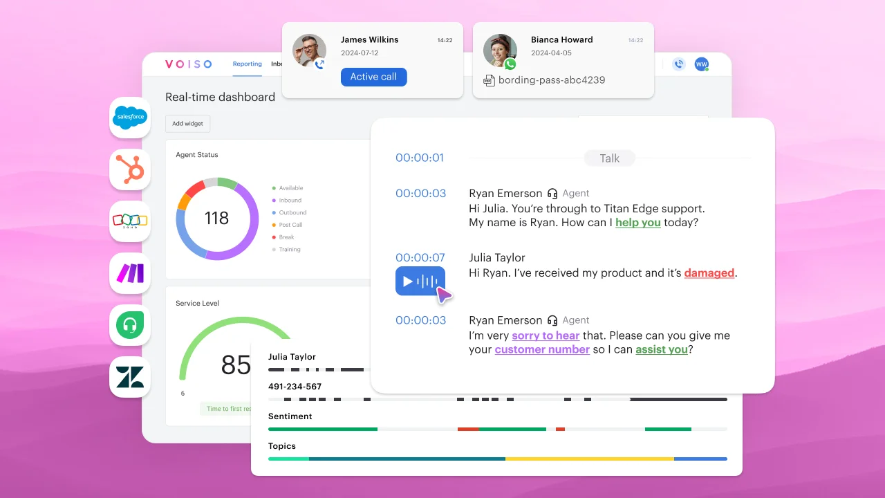
- Historical reports and real-time dashboards, filtered by campaign, queue, or account: The same underlying engine powers both the end-of-month summary and the live wallboard, filtered down to whatever slice a given account or supervisor needs to see. There’s no separate system to maintain for “the live version” versus “the official version.”
- CDR exports and webhooks: For BPOs that already have a data warehouse or an account-facing dashboard built on Power BI, exporting call detail records or pushing information out through webhooks means the numbers can feed whatever system an account already trusts, rather than forcing everyone onto a new interface. This matters more than it sounds; plenty of enterprise accounts have their own BI staff and simply want clean data delivered, not another login.
- SLA and service metrics built into the queue itself: Attainment, abandonment, and speed of answer are tracked at the queue level natively, rather than calculated after the fact from raw call logs. That distinction sounds small until you’ve tried to reconstruct SLA attainment manually from a CDR export and realized how many edge cases, transfers, callbacks, abandoned-then-recalled contacts, quietly break a spreadsheet formula.
- Wallboards for floor management: Live SLA status, queue depth, and agent availability, visible to supervisors in real time, tie directly back to the floor management point above: catching a problem while there’s still time to do something about it.
None of these four pieces work particularly well in isolation. A live wallboard without the underlying queue-level SLA tracking is just a pretty screen with nothing solid behind it. Historical summaries without a webhook or export option lock every account into one delivery format whether it suits them or not. Put together, though, they cover the full range from a supervisor’s screen on the floor to an executive’s monthly review, all pulled from the same underlying source.
A Simple Framework for Cleaning Up the Numbers
Rather than rebuilding everything at once, a phased approach tends to work better in practice:
- Audit what actually gets sent today: Pull every account’s current report and note what data source each figure comes from. This alone usually surfaces inconsistencies nobody had noticed.
- Agree on a standard metric set: SLA attainment, abandonment, handle time, and campaign-level outcomes, defined the same way for every account, even if the visual template still varies.
- Centralize the underlying data first: Get every account pulling from the same source before worrying about how the output looks. A pretty report built on inconsistent inputs just hides the problem better.
- Add real-time access where it earns its place: Not every account needs a live wallboard, but the option should exist for the ones handling anything time-sensitive.
- Automate the recurring exports: Once the data and metrics are standardized, the manual assembly step is usually the easiest thing left to remove.
None of this needs to happen in one sprint. Even getting through step one honestly tends to be uncomfortable, and useful, in roughly equal parts.
Realistically, most operations move through this over one or two quarters rather than one heroic sprint. The audit step alone often takes longer than expected, mostly because finding every place a figure gets touched by hand takes real digging. Once the underlying source is unified, though, everything downstream, the templates, the live views, the exports, tends to fall into place faster than the early steps suggested it would.
Ownership matters more than most operations initially plan for, too. Someone senior enough to make the underlying source changes stick, without every account renegotiating their own custom exception, needs to actually own this project end to end. Spreading it across whoever has spare capacity that quarter tends to produce a half-finished version that reverts to old habits the moment attention moves elsewhere.
Common Mistakes That Undermine Trust
A handful of patterns show up again and again once you start looking closely at how reports actually get built, and most of them trace back to the same root cause: a report was built to solve an immediate problem for one account, then never revisited as the business grew around it. None of these mistakes are dramatic individually. Together, across a large portfolio, they’re exactly what turns a manageable operation into the fragile mess described at the start of this piece.
- Different formulas for the same metric across accounts: One group calculates abandonment one way, another calculates it a slightly different way, and nobody notices until an account compares notes with another account.
- Confusing “on time” with “accurate”: A report that arrives every month like clockwork but contains stale or wrong figures does more damage than one that’s occasionally late but always correct.
- Treating Excel as a permanent solution: It’s a fine starting point. It becomes a liability once twenty accounts and a dozen contributors are all editing versions of the same file.
- Hiding weak campaigns inside blended totals: It buys short-term comfort and costs long-term trust once an account eventually asks for the breakdown, which they usually do.
- No real-time option at all: Even accounts that never check a live dashboard tend to feel better knowing one exists; its absence quietly signals something’s being managed rather than shown.
- Letting one person become the single point of failure: If only one analyst fully understands how a figure gets calculated, that knowledge walks out the door with them, whether through a vacation, an illness, or simply leaving the company. Documenting the calculation logic, not just running it, protects against a surprisingly common and entirely avoidable failure mode.
FAQs
That covers the core of it: what to show, when to show it live versus on a schedule, and how to build it once instead of twenty separate times. A few sharper questions tend to come up once an operation actually starts this kind of cleanup.
What’s the difference between an SLA report and a QA report?
An SLA report tracks whether service commitments were met: attainment, abandonment, handle time, speed of answer. A QA report tracks the quality of individual interactions: adherence to script, tone, compliance, resolution accuracy, usually through call scoring or review. They’re related but answer different questions. SLA tracking tells an account whether the contract terms were honored. QA scoring tells them whether the conversations themselves were good, which SLA numbers alone can’t capture.
How often should BPOs send SLA reports to clients?
Most contracts specify monthly at minimum, though weekly summaries are increasingly common for larger or higher-stakes accounts. The right cadence depends on contract terms and how much day-to-day variability a campaign sees. What matters more than frequency is consistency: an account that knows exactly when to expect a report, and trusts it’ll arrive on schedule with accurate figures, tends to ask far fewer ad-hoc questions between cycles than one on an unpredictable schedule.
What’s a good SLA attainment rate to aim for?
There’s no universal figure, since targets are set per contract and vary by industry, channel, and campaign type. What matters more than any specific benchmark is consistency against whatever target was actually agreed, and transparency when it’s missed. An operation hitting 85 percent against an 85 percent target is meeting expectations; one hitting 90 percent against a 95 percent target is still falling short, even though the raw number looks higher.
Can real-time dashboards replace end-of-month reports entirely?
Not entirely, though they can reduce how much the monthly version needs to cover. Real-time dashboards are built for immediate action: catching a problem while there’s time to fix it. Monthly reports serve a different function, trend analysis, contract review, and the kind of business conversation that benefits from looking back over a longer window. Most mature setups run both, with the live view feeding daily floor decisions and the periodic summary feeding account-level strategy.
What’s the difference between average handle time and average speed of answer?
Average handle time measures how long an interaction takes once a team member picks it up, including any after-call work. Average speed of answer measures how long a caller waits before that happens. They sit at opposite ends of the same interaction and usually move somewhat independently. An operation can have excellent handle time and still miss SLA targets badly if speed of answer is the actual bottleneck, which is why both belong in a report rather than just one.
How do you handle SLA reporting across multiple time zones or shifts?
The cleanest approach is standardizing on one calculation time zone for these purposes, usually the account’s primary business hours, while still capturing raw timestamps in a way that supports shift-level breakdowns internally. Reports that mix time zones without labeling them clearly are a common source of disputes over whether a target was actually hit. Being explicit about which clock a report runs on, and noting shift handoffs where SLA dips tend to cluster, heads off most of that confusion before it starts.
Standardized reporting gives clients clearer visibility, but sustainable growth also depends on the right technology, processes, and commercial support. Explore Voiso’s BPO Growth Program to see how your outsourcing business can improve operational efficiency, strengthen client relationships, and scale more effectively.
Further Reading