All Products

.svg)






Contact center software is genuinely hard to evaluate before you buy it.
You can watch a demo. You can see the dashboard. You can ask about integrations, uptime, routing, reporting, AI features, and implementation. You can compare pricing and read product pages.
But you still cannot fully feel the product before you use it.
You cannot feel how reliable the platform is during a busy day. You cannot feel how intelligently a call gets routed when pressure is high. You cannot feel how well the AI handles a real customer conversation until it is actually inside your operation.
That makes the buying decision difficult.
And when people need to judge something complex before they can experience it properly, they start looking for signals.
Not always consciously. Not always in a structured way. But they do it.
They look at how the brand presents itself. They notice whether the website feels coherent. They notice whether the visuals feel real or generic. They notice whether the product story feels consistent across touchpoints. They notice whether the company looks like it understands its own category.
In a market like contact center software, visual identity is not just decoration.
It is part of how buyers decide whether to trust you enough to look deeper.
When the Product Is Hard to Judge, the Brand Carries More Weight
A contact center platform is not an easy product to assess from the outside.
The most important parts of the product are often invisible at first glance. Reliability. Speed. Routing logic. AI accuracy. Call quality. Agent experience. Supervisor visibility. Reporting depth. Workflow flexibility.
These are things that matter deeply, but they are difficult to verify in 40 seconds on a website.
So buyers use the evidence they can see.
They read the surface for clues about the depth.
Does the brand feel consistent?
Does the product look serious?
Does the messaging feel clear?
Do the visuals feel like they belong to the same company?
Does the experience feel considered, or does it feel stitched together?
This is not vanity. It is inference.
A buyer scanning a website is often asking a simple question without saying it out loud:
Do these people have their act together?
That question matters.
Because if the brand looks careless, generic, inconsistent, or disconnected, the buyer may start to question the company behind it. Even if the product itself is strong, the visual layer may already be creating doubt.
Visuals Become a Proxy for Operational Competence
In design, we often talk about aesthetics, but in B2B software, visual quality does something more practical.
It signals competence.
A clean and consistent visual system suggests discipline. Realistic imagery suggests understanding. A coherent brand experience suggests alignment. Strong product storytelling suggests that the company knows what problem it solves and who it solves it for.
Of course, visuals do not prove the product works.
But they can influence whether a buyer believes the product is worth investigating.
This is especially important in a category where the risks are high. Contact center software touches customer conversations, sales performance, support quality, agent productivity, reporting, compliance, and brand reputation. Buyers are not only choosing a tool. They are choosing something that sits between their business and their customers.
That means every signal matters.
A generic stock image might seem harmless.
A cheap-looking AI render might seem convenient.
An inconsistent visual system might seem like a small brand issue.
But together, those choices send a message.
They suggest how much care the company puts into the details.
And in a category where details affect customer experience, that matters.
The AI Category Has a Credibility Problem
This becomes even more important when the product is AI-powered.
AI is everywhere now. Every company wants to say it has AI. Every product page wants to sound intelligent, automated, predictive, and future-ready.
But buyers are also becoming more skeptical.
They have seen inflated claims. They have seen vague promises. They have seen brands use AI as a label without showing much substance behind it.
So when a company sells AI-powered software but its own marketing looks cheaply AI-generated, it creates a credibility gap.
The buyer does not simply think, “That image looks artificial.”
The buyer may think, “If this is how they handle their own brand, how will they handle my customer experience?”
That is the risk.
Bad AI visuals do not only look bad. They can make the AI promise feel less believable.
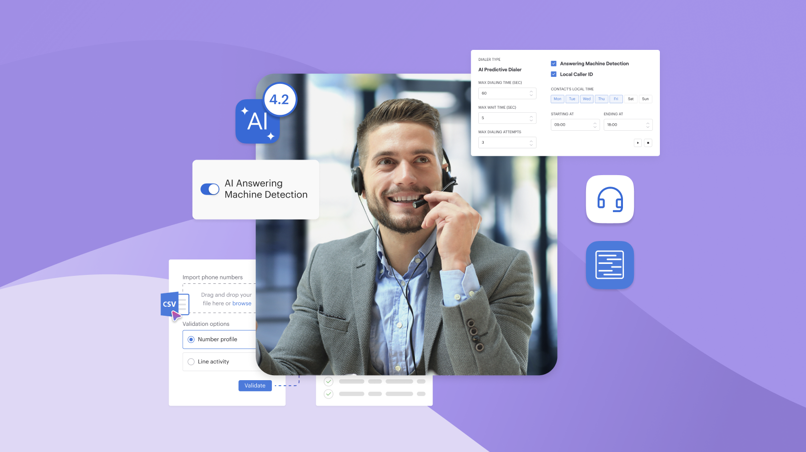
For a company like Voiso, where the product helps businesses manage real customer conversations, the visual language needs to feel grounded in reality. It needs to show people, conversations, teams, and customer moments in a way that feels believable. Not staged. Not uncanny. Not disconnected from the world our customers actually operate in.
If the brand is talking about human connection, the visuals have to support that promise.
Everything your team needs in one platform
Trust Is Built Across Touchpoints
A brand is not experienced in one place.
A buyer may first see a LinkedIn post. Then a campaign landing page. Then a product page. Then a review site. Then a demo deck. Then an event booth. Then a follow-up email. Then a case study.
Every touchpoint either strengthens the signal or weakens it.
If the brand looks different everywhere, the buyer feels that. If the imagery changes style every time, the buyer feels that. If the design language is inconsistent, the buyer may not explain it, but they sense the lack of coherence.
Consistency matters because it makes the company feel dependable.
It tells the buyer that there is a system behind the surface. That the company is not improvising every interaction. That the same level of care is present wherever they meet the brand.
This is not about making everything look identical.
It is about making everything feel connected.
The colors, typography, imagery, motion, product visuals, illustrations, campaign assets, and social content should all point in the same direction. They should create one clear impression: this is a company that knows who it is, what it builds, and why it matters.
Real Does Not Mean Boring
One of the biggest challenges in B2B design is making things feel real without making them feel dull.
Contact center software is serious, but the visual world around it does not need to be lifeless. The goal is not to fill every page with generic people wearing headsets or predictable office scenes.
The goal is to create imagery that feels specific, human, and credible.
Real people in real conversations.
Teams solving real operational problems.
Customer interactions that feel natural.
Product moments that feel practical.
Visuals that support the story instead of distracting from it.
This takes more work than choosing a stock image or generating something quickly. It requires direction, editing, restraint, and consistency. It requires asking whether the image actually helps the buyer trust the company more.
Because the job of visual identity is not only to look good.
It is to reduce uncertainty.
Design Cannot Save a Bad Product
It is important to be honest about this.
A strong visual system cannot save bad software.
If the product is unreliable, if the AI does not work, if support is weak, if implementation is messy, design cannot cover that forever.
But in a category where the product is hard to evaluate cold, design can decide whether the buyer gives the product a chance at all.
That is the point.
Visual identity does not replace product quality. It creates the conditions for product quality to be taken seriously.
It opens the door.
It makes the buyer feel that the company is worth a conversation.
It helps the product get the opportunity to prove itself.
And when the product is strong, a clear visual system helps the market understand that strength faster.
Why This Matters for Voiso
At Voiso, visual identity is part of how we earn trust.
It is not a coat of paint applied at the end. It is part of the way we communicate competence, reliability, and human connection before a buyer ever speaks to our team.
This matters because Voiso operates in a category where trust is critical.
Our customers rely on contact center technology to support sales, service, customer experience, and growth. They need to know that the platform is reliable. They need to feel that the company behind it is focused, organized, and serious about the work.
Design plays a role in that.
It helps make the competence visible.
It helps make the brand feel coherent.
It helps make our promise more believable.
And most importantly, it helps remove doubt.
The Goal Is Not Design That Impresses
The goal is not to make design that impresses people for a few seconds.
The goal is to make design that reassures them.
Design that makes the company feel clear.
Design that makes the product feel credible.
Design that makes the AI promise feel grounded.
Design that makes the human connection feel real.
In a market where buyers are constantly making judgments from the signals in front of them, visuals matter because they are often the first evidence a brand provides.
Before the demo.
Before the sales conversation.
Before the product can prove itself.
The most valuable thing a brand’s visuals can do is make competence feel real before the product gets a word in.
That is design that removes doubt.
And that is the kind of design worth building.